Use sRGB when the destination is out of your hands
Adobe's colour management chapter for Lightroom Classic, Color management in Lightroom Classic (last updated 27 April 2021), describes profiles as the mechanism that reconciles colour differences among devices so that you can predict what you will see when you share or print a photo. It also notes that sRGB is a relatively small space used by many web browsers, and gives the export instruction in plain terms: export using sRGB if you are going to share photos online.
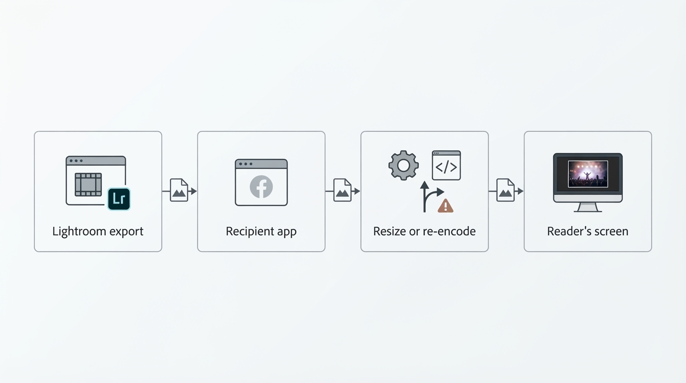
A concert frame rarely goes straight from your catalogue to the person who needs it. It goes to a musician's site template, a venue's social account, a magazine's content system, a promoter's deck, or an editor who drops it into a layout at two in the morning. Each of those steps applies its own conversion, its own resizing and its own assumption about an embedded profile.
What Display P3 changes in a stage frame
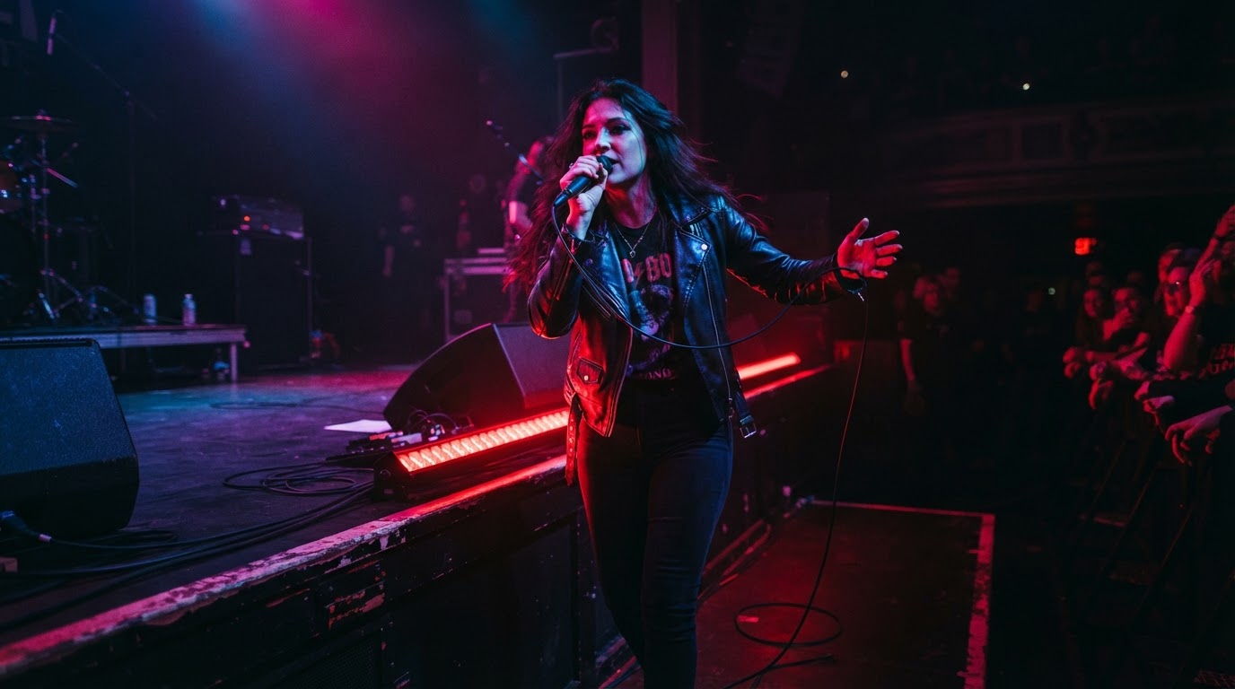
Display P3 has wider primaries than sRGB, and concert lighting is one of the cases where that matters. Deep reds, magentas and cyan LED washes at a show can sit outside sRGB and inside P3. A P3 file can encode those values directly instead of mapping them into the smaller space, and on a display that covers the extra range the difference can be visible in the most saturated part of the frame.
Two limits keep this in proportion. First, a tag is not a repair: if a wash clipped at capture or you pushed the highlights during editing, wider primaries change which colours can be encoded, and the clipped channel stays clipped. Second, choosing a Display P3 profile does not by itself establish whether a JPEG is SDR or HDR. In Lightroom Classic, HDR is a separate control, not a colour space: Adobe's export reference, Export files to disk or CD (read 27 October 2026), places HDR quality behind an HDR Output checkbox in the File Settings panel and notes that a JPEG exported with HDR output carries a gain map. Picking Display P3 as the colour space does not switch that on, and a Display P3 export is not evidence that the file is HDR.
A wider gamut is not a substitute for the intended edit. Profile interpretation, HDR or SDR processing and the destination renderer can also affect tonal appearance, so check the actual delivered image.
When the wider tag earns its place
Display P3 is the better choice when you know enough about the other end to say what happens to the tag. That usually means a client, editor or platform that opens the file with colour management on, keeps the profile through its own processing, and gives you a chance to look at the rendered result before it goes public. A colour-managed review, a site whose build step you control, or a client who sends back the exact file they published all qualify, because you can check the outcome and re-export if it went wrong.
A social platform may re-encode or convert an upload. A flat image or shifted red alone does not identify whether the profile, editing, tone mapping, compression or viewing conditions caused the difference. Compare the exported file and the delivered rendition in the intended viewing conditions; use an sRGB re-export as a practical comparison, rather than treating its success as proof of one cause. A recipient’s explicit file specification takes precedence.
What you know about the recipient | Export | Reason |
|---|---|---|
No information, or a pipeline you have not inspected | sRGB | Adobe recommends sRGB for online sharing; verify the delivered image |
Client tooling reports the embedded profile and you can review the final render | Display P3 | May retain colours outside sRGB when the image and receiving path support them |
Posted to a social platform, judged on unknown phones | sRGB | You cannot verify which rendition the platform serves |
Recipient publishes a file specification | Their specification | Their pipeline, their profile |
Print or a print lab | Ask for the lab profile | Neither space is a print decision |
Find the colour space control in your own build
In Lightroom Classic the choice lives in File > Export, in the File Settings panel. Adobe's export reference explains that the Color Space drop-down converts the photo to the chosen space and tags the photograph with the matching profile, and that the Other option accepts a custom profile. That tagging step is the part that travels with the file; the numbers alone are meaningless without it.
For adjustments made before export, the guide to editing concert photos in Lightroom covers that separate task.
Adobe's two documents do not list the same menu. The Lightroom Classic and Lightroom ecosystem feature comparison (updated 20 February 2026) lists export colour spaces as ProPhoto, Adobe RGB, sRGB and Display P3 for both Lightroom Classic and the ecosystem apps. The export reference read on the same day lists the Color Space options as sRGB, HDR colour space, AdobeRGB and ProPhoto RGB, with HDR handled by its own checkbox. The practical reading is that the exact wording and the availability of a Display P3 entry depend on your installed version and on which Lightroom you are running, so open the Colour Space menu in your own build before you plan a delivery around it. If Display P3 is not offered there, use a supported export profile or the recipient’s specified workflow; sRGB is the fallback for an unknown SDR web destination.
The File Settings panel sits alongside Export Location, File Naming, Image Sizing, Output Sharpening, Metadata and Watermarking, so one export run fixes format, dimensions and profile together.
Checks that catch the failures that actually happen
Confirm the profile before you send anything. The exported file should report the space you asked for when you open its file information in a colour-managed viewer; a file that reports sRGB after you chose Display P3 means the conversion happened somewhere you did not intend.
Judge three things at the size the reader will see. Look at face tones under the wash, at the most saturated light in the frame, and at the dark gradients between them, because those are the areas where a converted or dropped tag shows up first as a hue shift, a flat red, or stepped shadows. Then look at the delivered version: the uploaded page, the post, the layout proof, the client's review link. Your monitor at 100 percent is not the delivery.
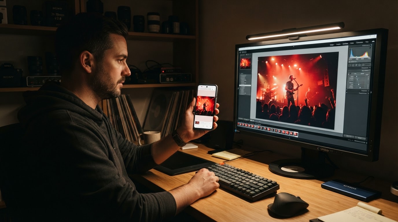
Keep the original. The archival raw and the edited catalogue file let you re-export for the next recipient without repeating the edit, and a second export is cheap compared with reshooting a show.
Print is a separate decision
Neither space is a safe print default. A concert print, a metal print or a magazine page runs through a press profile that the lab or the publisher controls, and a file tagged Display P3 or sRGB tells them what the numbers mean, not what their equipment can reproduce. Ask for the required profile and the file specification, and export to that. The sRGB habit protects a web handoff; it says nothing about a print job that has its own measured target.