Judge the shoreline before the color scheme
Most coastal art sold online is interchangeable: open water, a pastel horizon, a palm or two. A print of a specific shore reads differently, because it has structure — a granite ledge, a tide line, a breakwater, marsh grass bent the same way every season. That structure is what you keep looking at once the color stops feeling new.
Test any image with three questions. Can you name the kind of shoreline it shows? Is there a horizon at a legible angle instead of a soft blur? Does the weather look observed rather than invented? Three yeses usually mean the print will hold a wall for years.
Then decide which temperature you want. Cold water under an overcast sky leans quiet, silvery, blue-gray. Low evening sun leans warm and orange. Both belong in a coastal room, and they pull the space in opposite directions.
Match the print to the light the room actually gets
Light decides which print works on a given wall, and it changes through the day.
A north-facing room gets cool, even light all year. Cool blues and grays can read flat and slightly chilly there, so a warm scene such as late-day water or autumn marsh gives the wall some temperature. Pale gray walls amplify the same coolness.
South- and west-facing rooms take strong warm light in the afternoon. Saturated prints go loud in that light, and glossy surfaces turn into a second window. Deeper, less saturated scenes keep their shape under glare.
Check the evening condition as well. With lamps on and a window opposite the wall, glass and acrylic glazing behave like a mirror. A matte paper surface, or an unframed metal print, stays readable at night.
Do not commit to a position until you have seen the print, or a paper proof of it, in that room at the hour you use the room most.
Size the print to the wall and the furniture
Hanging decisions are hard to undo, and most people size coastal wall art prints to the image they like rather than to the wall it will sit on.
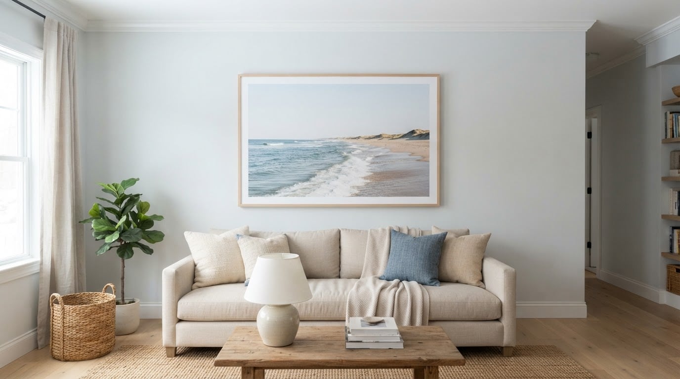
Start with the furniture. A single print or a group should span roughly two-thirds to three-quarters of the width of the sofa, console, or sideboard beneath it. Narrower and the art looks like a postage stamp on a big wall. Wider and it starts to read as a mural.
Leave a gap between the bottom edge and the furniture. Six to ten inches works in most rooms, and a hand's width is the useful check in a furniture showroom. Center the piece so its middle sits around 57 to 60 inches from the floor, close to eye level for a standing adult.
Wall situation | Width of the art | Typical arrangement | Check before drilling |
|---|---|---|---|
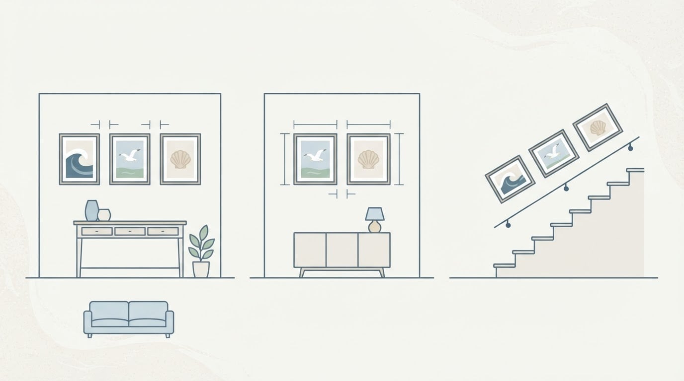
Above an 84-inch sofa | 50 to 63 inches | One large print, or a three-print row | Bottom edge 6 to 10 inches above the back |
Above a 60-inch console | 36 to 45 inches | One print, or a pair with a 2 to 3 inch gap | Group stays narrower than the furniture |
End of a hallway | 24 to 36 inches | One vertical print | Equal margins left and right |
Stairwell | Steps with the stringer | Three to five frames on the diagonal | Bottom edges parallel to the handrail |
Ceilings and trim matter too. Leave visible wall above the frame rather than pinning art to the ceiling line. In a hallway, one large print or a tight pair that fills at least half the wall length beats a row of small frames.
Group prints as one composed shape
A group works when it reads as a single object. Settle the outer rectangle first: width, height, and where its center lands. Then divide that rectangle.
Keep spacing consistent, usually two to three inches between frames, and let the gaps relate to the frame width. Narrow molding looks better with tighter gaps; deep frames need more air. Use the same frame profile and finish across the group unless you are deliberately building a mixed collection.
Align something. Horizons, top edges, or frame centers can line up, but pick one and hold it. Mismatched sizes with no shared alignment is what makes a good set look improvised.
For a three-piece row, make the outer prints the same size and let the middle one carry the difference. For a two-piece pair, keep both identical unless the images are clearly vertical and better hung as a stacked column.
For stairwells, step frames with the stringer and keep each bottom edge parallel to the handrail. The hang-at-eye-level rule does not apply there; the diagonal is the line the eye follows.
Mark the whole group with painter's tape before drilling, then mark hanger positions on the tape. Ten minutes of tape saves a wall of filler.
Salt air, humidity, and the materials that survive them
Salt air and humidity damage coastal wall art prints in ways that show up a year later, and the fix is mostly a material choice made before ordering.
Paper prints need glazing. Acrylic glazing is lighter and shatter-resistant, which matters on a wall a child or a dog passes; it also scratches and attracts dust through static. Glass gives cleaner clarity with more weight, and it can crack if the frame twists. On a cold pane in a warm, humid room, condensation can form on the inside, so a mat that holds the print off the glazing is not decoration — it keeps moisture from wicking into the paper.
Seal the back. A dust cover or rigid backing board limits how much humid air moves behind the print, and it keeps insects and grit out. Frames in solid wood or aluminum handle damp rooms better than particleboard, which swells at the corners and lifts the joints.
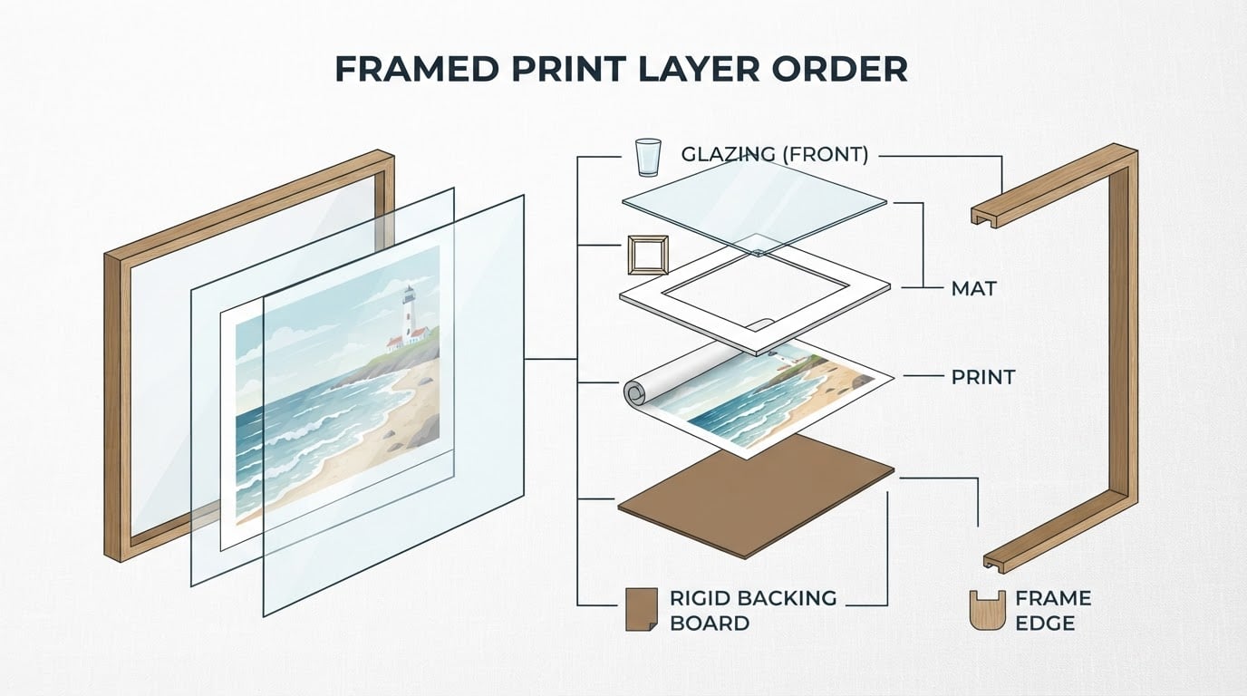
Hardware fails quietly. Zinc-plated screws and cheap wire rust in salt air and leave brown streaks down a painted wall. Use stainless or brass fixings, and check them after the first humid season.
Placement does as much work as material. Avoid an exterior wall without a vapor barrier, the space directly above a heat source, and the wall opposite a bathroom door that stays open. Direct sun fades dyes and heats the glazing; a sheer curtain or a different wall solves it.
Clean with a dry microfiber cloth. Ammonia and glass cleaner can cloud acrylic and leave residue in the corners of the frame. Twice a year, look along the bottom edge of the glazing for a tide line, and look at the hangers for rust.
Framing and hanging choices that survive the wall
Metal prints need no glazing, so humidity has nowhere to condense. The trade-off is reflectivity: a gloss metal surface bounces window light, and the panel dents at the edges if it takes a knock. Float-mounting it off the wall with a cleat, or setting it inside a shadow-box frame, keeps the surface proud of the wall and reads clean in a modern room.
Fine art paper rewards a mat. Two to four inches is a good default, wider on small images so the frame has presence. Scale the frame profile to the image, because hairline molding disappears around a large print and a heavy frame overwhelms a small one. Choose UV-filtering glazing if the wall catches any direct sun.
For hanging, find the studs and use them when they line up. In older plaster-and-lath walls, use self-drilling toggle anchors rather than plastic plugs, which pull out under a heavy frame. Two D-rings and two hooks, set level, distribute the load better than a single wire. Skip picture wire for anything large or heavy, since the wire sags and the frame drifts.
Recheck level a day later. Frames settle, especially on plaster, and the correction takes seconds.
How the New England shoreline reads differently
Regional shoreline photography is a different product from tropical beach decor, and the difference shows up in the details of the scene.
Winter light, granite scoured by ice, tide pools, marsh grass turning brown in November, a lighthouse on a cold horizon: those are the subjects in the Fine Art Print Store at Practical Photo Notes, which lists thirteen New England landscape photographs made to order in two formats, Metal Print and Fine Art Paper Print. Titles such as Coastal Beacon, Coastal Rhythm, and Stone and Water point at locations rather than moods.
Each listing records location, subject, style, orientation, and available formats, and pairs that with interior mockups that show the print at room scale. That is the practical advantage over a generic beach print: you can judge proportion and orientation before ordering, and you know which shore you are hanging.
If a room is already warm wood and brass, a gray-silver New England frame adds contrast without adding another color. If the room is white and cool, a late-day or autumn frame brings the warmth the wall is missing.
Trade-offs worth settling before you order
Every format choice trades one kind of durability for another, and the right answer depends on the room.
- Metal: no glazing and no condensation, low maintenance — reflective surface, edge dents, and fewer matting options.
- Fine art paper: best detail and flexible framing — glazing, weight, and a real humidity risk if the back is left open.
- Glass glazing: clearest image, scratches least — heaviest option, cracks, and shows condensation on a cold pane.
- Acrylic glazing: light and safe near children and pets — scratches easily and holds static dust.
- One large print: strongest single statement, simplest to hang — less flexible if you move, costly to change.
- A grouped wall: flexible and built over time — alignment errors show, and every frame needs planning before the first hole.
The limiting case is a damp, unheated coastal room with direct sun. There a metal print is the lower-risk choice, and a paper print needs sealed backing plus UV glazing to last more than a few seasons.
A ten-minute check before you order
Run these checks in order, and most of the expensive mistakes get caught early.
- Measure the furniture width and the clear wall above it.
- Note which hours the wall gets direct sun, and whether a window faces it.
- Decide single print or group, then sketch the outer rectangle to scale.
- Confirm the format against the room's humidity: paper needs glazing and a sealed back, metal needs neither.
- Tape the rectangle on the wall and stand where you will actually look at it.
- Order only after that, and leave the tape up until the frame arrives.
When those six steps line up, the print stops being decoration and becomes the thing the wall was missing.